This post is inspired with a discussion we had once at our workplace. It started with a question, asked by one of the backend developers:
Why do we have negative margin in CSS, while there’s no possibility to set negative padding?
The first thing which comes to mind is probably: “Because negative padding makes no sense!”. It’s not a complete answer though. I like such “out of the box” (pun intended) questions, so I’ll try to break down the problem and take a closer look of the box model. The spec defines it as it goes:
The CSS box model describes the rectangular boxes that are generated for elements in the document tree and laid out according to the visual formatting model.
– W3C

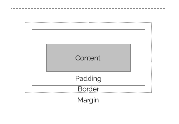
Every box has its content area which optionally can be surrounded by padding, border and margin area. Each of them has different purposes. Let’s focus on the padding and the margin:
- Padding pushes away the border from the content, so it makes the space around the content. When it’s set to zero, the padding edge is the same as the content edge.
- Margin pushes away the content from any other existing boxes. It is used to make the horizontal and vertical space between elements. When margin is set to zero, it means that the margin edge is the same as the border edge.
It’s possible to set box model values by setting corresponding CSS properties (for example, to apply element’s dimensions, use width and height, and padding to set padding width). You must keep in mind that there are several differences between setting the box model properties for block level and inline level elements.
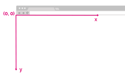
Box model properties are essential for the browser to determine the coordinates of the element and the space that it occupies on the page. Browser uses a coordinate system with (0,0) point placed in the top left corner of the document (which pretty much corresponds with the html element). Elements’ positions are measured in pixels with positive x direction going to the right and positive y direction to the bottom.

Understanding negative margin
Despite its “hackish” reputation negative margin is allowed by the specification. If applied with care and deep understanding, they produce valid code.
Like I mentioned above margins are used to create spacing between elements. To add any whitespace the margin value must be more than zero. Therefore, if we set negative margin value, it will cause elements to overlap. Let’s see how the elements with negative margin set behave:
For every element with position: static (which is the default position property value) and no float applied:
- When top or left margin is set to negative value, it pulls the element and the following elements up or left.
- When bottom or right margin is set to negative, it pulls only the following elements up or left.
Every element with position value other than static (which means: absolute, relative or fixed) creates new stacking context. Absolute positioning removes the element from the document flow. In this case the main difference will be not pulling the following elements in the direction of negative margin. The same goes for elements with fixed positioning.
Case becomes a little more complex for floated elements. However the thing can be a little quirky and doesn’t really fall within the scope of this article, so if you’re interested I encourage you to further reading.
Differences between negative margin and relative positioning
Applying position: relative makes an element shift its position relatively to its original position. Having that in mind one may assume that this technique does exactly the same as negative margin. There are two main differences though:
- The element’s original position remains in the flow of the document. It means that if we apply, for example
top: -20px, the element will be shifted upwards but its original space will remain and the following elements will not be shifted. - For an element with
position: relativethez-indexproperty will work. You must keep in mind thatz-indexworks only for positioned elements.
Use cases of negative margin
Nowadays there are several use cases when negative margin can come in handy:
- Centering a block element of known dimensions (source: CSS-Tricks guide for centering):
.parent {
  position: relative;
}

/*
  Element that should be centered
*/
.child {
  position: absolute;
  top: 50%;
  left: 50%;
  height: 200px;
  width: 200px;
  margin-top: -100px; /* Half of the element's height */
  margin-left: -100px; /* Half of the element's width */
}- Implementing design with overlapping elements. This is quite popular use case and negative margin allows you to achieve this effect without breaking the document flow.
- Creating full-width elements within padded containers:
.parent {
  padding: 1.5rem;
}

/*
  Element that should have full width
*/
.child {
  width: 100%;
  margin-left: -1.5rem;
  margin-right: -1.5rem;
}- “Clearing” the leftmost and rightmost gutter padding in grid systems. Take a look at an example from Bootstrap:
<div class="row">
  <div class="col-sm-6"></div>
  <div class="col-sm-6"></div>
</div>
.row {
margin-right: -15px;
margin-left: -15px;
}
.col-sm-6 {
padding-right: 15px;
padding-left: 15px;
}I think there are just a few examples of “non-hacky” uses of negative margin. If you encountered any other, share it in comments!
##Why we don’t have negative padding then?
The word “padding” refers to something inner. That’s because the idea of negative padding may appear counterintuitive. Element with negative padding would be like something with an inside-out lining.
Imagine that setting negative padding values is possible. When padding value is set to zero, the border edge is the same as the content edge. When we set it negative, then border will overlap the content. Maybe that would be useful but, hey, content extended beyond its boundaries? That would make calculations of the element dimensions and position on the page definitely troublesome.
###Hypothetical behavior of negative padding
Let’s have a <p> element with some text content, padding and border:
<p class="example">Lorem ipsum dolor sit amet.</p>.example {
font-size: 16px;
padding: 8px 0;
border: 1px solid blue;
}This is how it renders in the browser:
For this example purposes, let’s assume that it’s possible to set the negative padding for an element:
.example {
  padding: 8px 0 -8px 0;
  border: 1px solid blue;
}
Then the element would probably be rendered like that:

The element’s bottom would probably be “cut out” by the bottom border. Let’s go further with our thought experiment and set to negative value also the top padding:
.example {
  padding: 0 -8px;
  border: 1px solid blue;
}
When the element is rendered, it’s essential for the browser to know the exact dimensions of its content. In this case we can assume that the height still has the value of 16px (the font size). But at the same time we see how negative padding would influence the element’s position. When content extends its boundaries (the border), the space occupied by the content overlaps the margin space!
These all above are just my speculations. I’m not really sure if that was the reason for making negative padding invalid. If you stumbled upon any reliable resource that explains the decision behind allowing negative margin and disallowing negative padding, feel free to share it in the comments!
##Resources
Online resources that I was referring to while writing this article:
- W3C specification for box model.
- W3C specification for visual formatting model.
- MDN article about box model.
- Article about Block Formatting Contexts on Sitepoint.
- MDN article about determining elements dimensions and resources from MSDN on the same topic.
- How browsers work explained on HTML5Rocks.
- Community feedback on stackoverflow about negative margin and negative padding was also very helpful.
Thank you for reading!